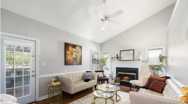
Two neighbours. Same apartment layout. Same natural lighting. One walks into her home and everything feels cohesive, intentional, genuinely beautiful. The other spent more money on furniture, more time planning, yet something always feels slightly off. The walls look fine individually but never quite right together. The difference? One understood paint colour logic. The other was just picking shades she liked without understanding why they work together.
This gap between colours that look good individually and color combo for walls that actually work together confuses almost everyone initially. A gorgeous dusty pink and a beautiful sage green, both are lovely colours separately. Put them together on adjacent walls and suddenly the room feels chaotic. Meanwhile someone pairs what seems like a boring warm white with a muted terracotta and the space looks like a design magazine spread. The logic behind this isn’t mysterious, it’s just unexplained.
Understanding paint colour relationships changes how you approach every room. Stops the guessing. Stops painting over mistakes three times before getting it right. The principles aren’t complicated once someone actually explains them properly rather than just showing finished results and expecting you to reverse-engineer why they work.
The Foundation: Undertones Matter More Than Paint Colour
Every paint colour contains undertones. The white that you’re looking at, might be slightly pink, slightly yellow or slightly blue. That grey might lean green or purple depending on lighting. When colour combo for walls goes wrong, undertone clashing is usually why.
Two colours that look compatible on swatches fight each other on walls because their undertones conflict. Understanding undertones before selecting any paint colour eliminates this problem entirely. Check swatches in actual room lighting. Undertones shift dramatically between natural daylight and evening artificial light.
The 60-30-10 Rule for Color Combo for Walls
Successful colour combo for walls follows a simple proportion principle. Dominant colour covers roughly 60% of the space i.e. usually the main walls. Secondary colour takes about 30% i.e. an accent wall or architectural elements. The remaining 10% goes to accents through furnishings and accessories.
This proportion works because it creates visual hierarchy without overwhelming. Every room needs a clear dominant paint colour that establishes the overall mood. Secondary colours add interest and depth. Breaking this proportion i.e. equal amounts of competing colours, for example, creates visual chaos that feels exhausting rather than dynamic.
Smart Color Combo for Walls That Transform Spaces
The most overlooked factor in paint colour selection is how drastically light transforms colour. That perfect terracotta tested under overcast morning light turns almost orange by afternoon sun. That sophisticated dark green looks stunning in natural light, and feels like a cave under yellow artificial lighting.
Test any colour combo for walls across multiple times of day before committing. What works at noon might fail by evening. North-facing rooms need warmer tones to compensate for cool, indirect light. South-facing rooms can handle cooler shades because warm sunlight balances them naturally.
See also: Timeless Elegance in Everyday Accessories
JK Maxx Paints: Products That Perfect Your Color Combo for Walls
Getting paint color logic right means nothing if the paint itself doesn’t deliver. Colour accuracy, sheen quality, and longevity determine whether carefully chosen combinations actually look as intended on finished walls.
Majesta Tru-Pearl brings colour combo for walls to life with its pearl-like lustrous finish and 4D Finish technology. Rich sheen adds dimension that flat paint simply can’t achieve. Colours shift beautifully as light moves through spaces. Stain resistance keeps those carefully chosen colours looking pristine. The 12-year warranty backs colour longevity that actually justifies the time spent choosing correctly.
WipEazy ensures paint colour investments survive real life. Best-in-class washability means those perfect wall colours stay perfect even in high-contact areas. Stain Guard Technology prevents everyday accidents from becoming permanent colour distortions. Rich sheen maintains the intended finish appearance long-term. Ten-year warranty guarantees the colour combo for walls you worked hard to get right actually lasts.
Paint Color Logic in Practice
Stop picking colours you love individually and hoping they work together. Check undertones first. Follow proportion principles. Consider room temperature and light direction. Test properly before committing fully.
The difference between rooms that always feel slightly wrong and spaces that feel exactly right usually comes down to understanding these fundamentals rather than just having better taste.